


Overview
똑똑한개발자의 코워킹 스페이스 T-POD(티팟)의 브랜딩 및 WEB 디자인 진행 과정을 소개합니다.
T-POD은 프리랜서, 1인기업, 크리에이터와 함께 일하는 똑똑한개발자 내 코워킹 스페이스입니다.
똑똑한개발자의 'T'와 우주선의 본체에서 분리 가능한 부분을 의미하는 'POD'이라는 단어를 결합해 티팟이라는 브랜드 네임을 만들게 되었습니다.
T-POD is a shared office space within TOKTOKHAN.DEV for freelancers, single-person enterprises and creators. The name T-POD is a combination of ‘T’ from TOKTOKHAN.DEV and the word ‘pod’, a detachable part from the body of a spaceship.


T-POD이 하나의 우주선이라면 같은 공간에서 함께 일하는 우리는, 각자가 도킹 가능한 비행체가 아닐까 하는 생각을 했습니다.
각자 독립적으로 일하면서도 언제든 더 큰 가능성과 시너지를 갖고 결합하며 멋진 무언가를 만들어낼 수 있는, 작은 비행체가 모이고 결합하며 우리만의 우주를 만들어가는 그런 공간이 되기를 바랐습니다.
If this place was a spacecraft, all of us working together here thought that each other was a 'single aircraft' that could be docked.
Our goal is to create a space where people can connect for a stronger possibilty and synergy and create something amazing while allowing everyone to work independently.
So that create our own universe.

T-POD의 로고는 기존 TOKTOKHAN.DEV(똑똑한개발자)의 로고와의 연관성을 위해, 직사각형 그리드를 활용해 제작되었습니다.
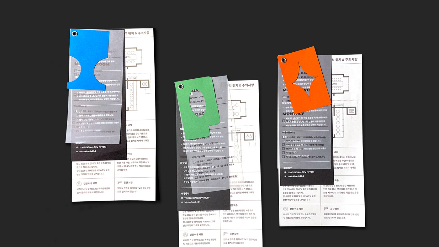
P, O, D의 알파벳은 각각 세 가지 종류의 멤버십을 상징하는 색상으로 표현됩니다. 이 세 글자를 전부 연결하는 T라는 하나의 우주선은 블랙&화이트 조합으로 통합됩니다. 각각의 코워커(Co-worker)들을 상징하는 별 모티프와 2D 및 3D 그래픽을 통해 일관된 브랜드 경험을 전달하고 공간 내의 아이덴티티를 부여합니다.


T-POD's logo was constructed using a rectangular grid to correlate with the existing TOKTOKHAN.DEV.
The letters P, O, D are expressed in colors that symbolize each of the three types of membership. One spacecraft called T, which connects all three letters, is integrated into a combination of black and white. Deliver a consistent brand experience and provide identity within the space through star motifs and 2D and 3D graphics that symbolize each co-worker.

각 멤버십 종류 별 총 세 가지의 색상이 브랜드 컬러로 사용됩니다. 해당 색상은 멤버십 및 공간 안내를 위한 리플렛 등의 어플리케이션에도 동일하게 적용됩니다.
A total of three colors for each membership type are used as brand colors. The same color applies to applications such as leaflets for place guidance.


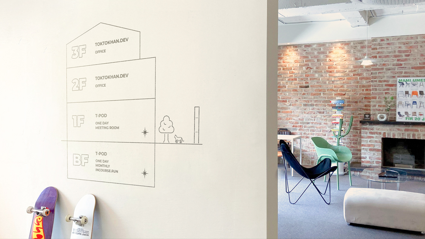
T-POD의 브랜드 아이덴티티는 공간 및 웹 인터페이스에도 일관된 형태로 적용됩니다.


Credit
2022.04 ~ 2022.05
Development _ Framer sites.
Jeong Ain


